Getting Started
InstallationPro InstallationPROUpgrade to v0.1Guides
Create a Custom Editor PanelComponents
ThemeEditorProviderHyperThemeEditorThemeEditorThemeEditorDrawerThemeEditorDrawerHeaderThemeEditorDrawerFooterThemeEditorRootPanelThemeEditorButtonColorModeToggleThemeIconHooks
useThemeEditorEditors
ColorsFont SizesTypography PROFonts PROLine Heights PROLetter Spacing PROShadows PRORadii PROSpace PROTypography Pack Editor PRO
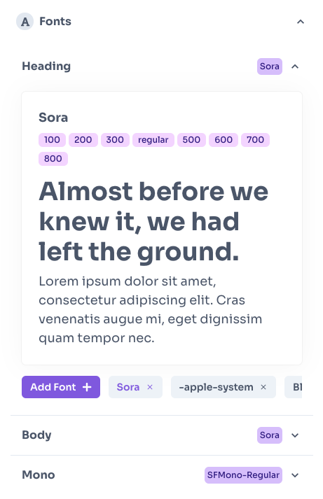
Edit all aspect of Chakra UI typography.
Typography Pack Editor it's a pack of grouped panels containing these editors:
- Fonts
- Font Sizes
- Font Weights
- Line Heights
- Letter Spacing
@hypertheme-editor-pro/chakra-ui-typography
Import
import { ThemeEditorTypography } from '@hypertheme-editor-pro/chakra-ui-typography'
Usage
ThemeEditorTypography works with the ThemeEditorDrawer component.
Put the ThemeEditorTypography component as a children of ThemeEditorDrawer and set icon and title props like in this example:
Prev
Font Sizes Editor
Next
Fonts Editor