Getting Started
InstallationPro InstallationPROUpgrade to v0.1Guides
Create a Custom Editor PanelComponents
ThemeEditorProviderHyperThemeEditorThemeEditorThemeEditorDrawerThemeEditorDrawerHeaderThemeEditorDrawerFooterThemeEditorRootPanelThemeEditorButtonColorModeToggleThemeIconHooks
useThemeEditorEditors
ColorsFont SizesTypography PROFonts PROLine Heights PROLetter Spacing PROShadows PRORadii PROSpace PROThemeEditorDrawer
The ThemeEditorDrawer component renders the drawer containing the actual theme editor UI.
It can be customized to render custom header/footer and panels.
The children of this component are rendered as accordions, all children must have: icon and title props.
View source
This component is usueful when you're creating a custom theme editor and you want to use the HyperTheme UI.
Import
@hypertheme-editor/chakra-ui-core leads to a known issue with recoil.Be sure that you're importing only from
@hypertheme-editor/chakra-ui or @hypertheme-editor-pro/chakra-ui.Community Version
import { ThemeEditorDrawer } from '@hypertheme-editor/chakra-ui'
Pro Version PRO
import { ThemeEditorDrawer } from '@hypertheme-editor-pro/chakra-ui'
Usage
The ThemeEditorDrawer is the component where all the actual editor panels lives.
In these examples you'll see how the ThemeEditorDrawer can be customized.
This component doesn't work on itself, it must be a direct child of the ThemeEditor component.
With Colors Editor
In this example we have created a MyThemeEditor component that provides the Colors Editor panel:
With Font Sizes Editor
In this example we're creating a MyThemeEditor component that provides the Font Sizes Editor panel:
Recreating the HyperThemeEditor
In this example we're recreating the HyperThemeEditor provided by the @hypertheme-editor/chakra-ui package.
Recreating the PRO HyperThemeEditor PRO
In this example we're recreating the HyperThemeEditor provided by the @hypertheme-editor-pro/chakra-ui package.
We're also hiding the "Upgrade to PRO" alert from the ThemeEditorDrawer to reflect the pro package:
Custom Panel
In this example we're creating a reusable MyPanel component that we can use inside the ThemeEditorDrawer:
Inline Custom Panel With ThemeEditorRootPanel
In this example we're using the ThemeEditorRootPanel component to render an inline Panel Editor:
Custom Drawer
In this example we're wrapping the ThemeEditorDrawer in a reusable component.
This tecnhique is usueful when you have multiple different theme editors but you want to maintain the same drawer configuration, for example for overriding the footer:
Props
| Name | Type | Default | Short Description |
|---|---|---|---|
children | ThemeEditorRootPanel | undefined | children must have icon and title props |
hideUpgradeToPro | boolean | false | Hide the Unlock Pro Features Alert |
hideCredits | boolean | false | Hide the credits |
headerComponent | ReactElement | ThemeEditorDrawerHeader | Set the Drawer Header |
footerComponent | ReactElement | ThemeEditorDrawerFooter | Set the Drawer Footer |
isOpen | boolean | false | Set Drawer visibility |
onClose | () => void | undefined | this callback is called by the Drawer close button |
children
Passing children to ThemeEditorDrawer is the method to add editor panels.
Children are rendered as a group of accordions and they must provide these two mandatory props:
iconof typeIconTypefromreact-iconspackage.titleof typestring
Here's an example of a custom dummy panel with a random icon (you can search for icons here):
hideUpgradeToPro
The hideUpgradeToPro prop hides the Unlock Pro Features Alert.

By default it's hidden when using thePRO version.
This prop accepts a boolean value.
hideCredits
The hideCredits prop hides the credits that are visible below the last editor panel.

By default the credits are always visible.
This prop accepts a boolean value.
headerComponent
By default the ThemeEditorDrawer renders a ThemeEditorDrawerHeader (like in the image below).
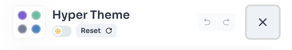
With the headerComponent prop you can override the header component and render what you want, check the example below:
This prop accepts a ReactElement value.
footerComponent
By default the ThemeEditorDrawer renders a ThemeEditorDrawerFooter (like in the image below).

With the footerComponent prop you can override the footer component and render what you want, check the example below:
This prop accepts a ReactElement value.
isOpen
The isOpen prop hide or show the ThemeEditorDrawer.
This prop is overrided by the ThemeEditor component, so you don't have to mind it.
onClose
The onClose prop is called when clicking on the "close drawer" button in the header.
This prop is overrided by the ThemeEditor component, so you don't have to mind it.
Prev
Next